For a project in my Intro to Graphic Design class, I was prompted to plan a fictitious event and create a corresponding poster and three social media posts. The event I chose was a dorm game night.
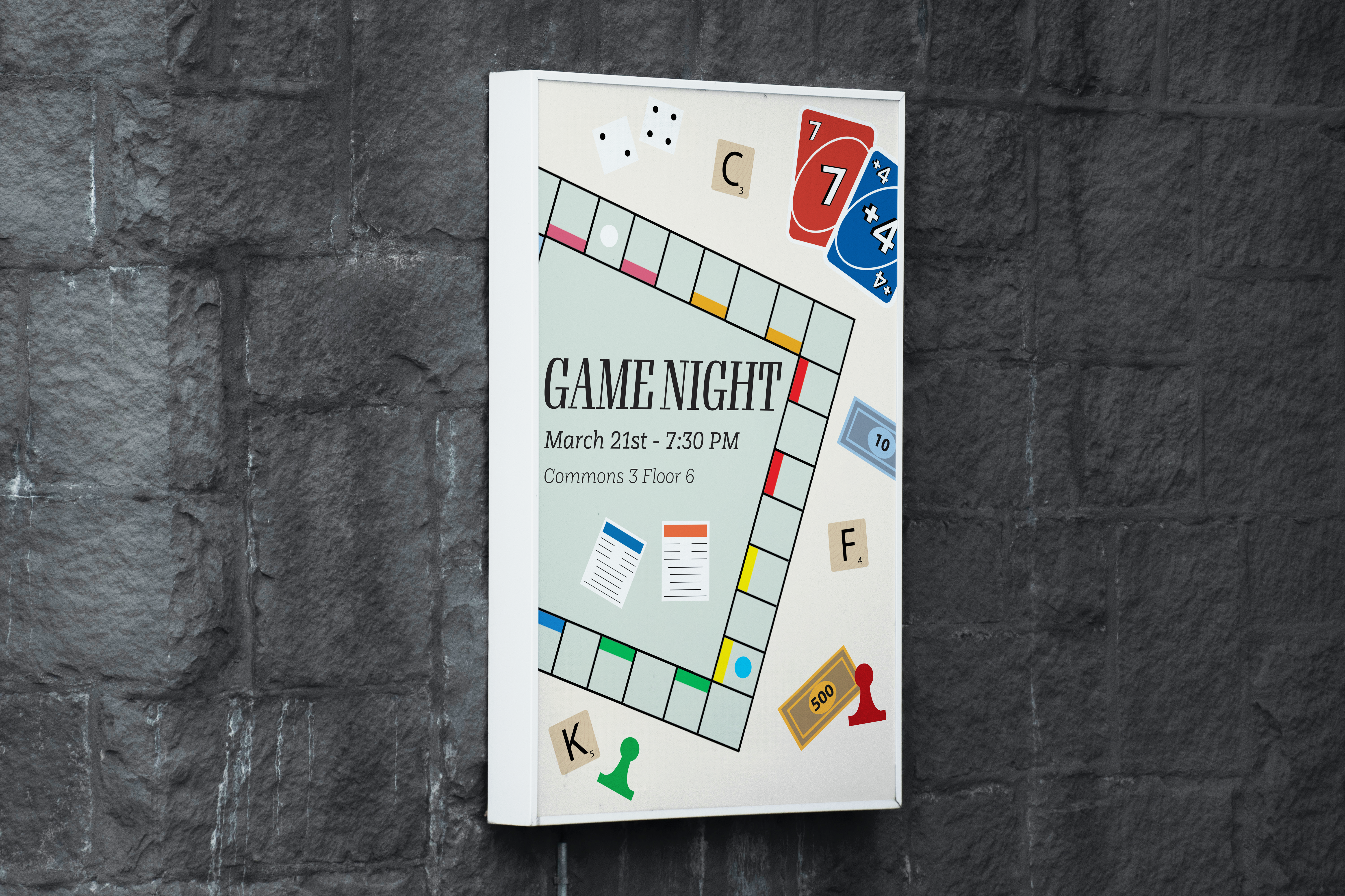
For my poster, I chose a lighter background that contrasted well with the bright colors of the different game pieces. I also used a variety of alignments and sizes for the game pieces, as this helped to convey a “messy” and communal game night setting. Additionally, I aligned my text to the left side of my page, which created a sense of balance between the game pieces and the text. Similarly, using simple font types help to draw the viewers’ eyes away from the “mess” of the game pieces and towards the important information.

For my social media posts, I chose to incorporate various game pieces from my poster, along with using the same fonts and background colors. I aligned my game pieces in ways that differed from how they appeared in my poster. Additionally, I aligned my text to the center of my posts to create a sense of balance with the random alignment of the game pieces. These two strategies helped to promote balance in my social media posts and cohesion between my social media posts and my poster. I also used simple fonts used in the poster, which can help to draw the viewers’ eyes towards the more important information.
Leave a Reply